Gallery
The gallery should help you to see the themes and colors applied in different plots. This template can also serve as an inspiration to get an idea of which graphics might be suitable for your case. Note that this template should not be considered as a 1 to 1 guideline but rather as a tool which helps statworx to create a more coherent picture when visualizing data.
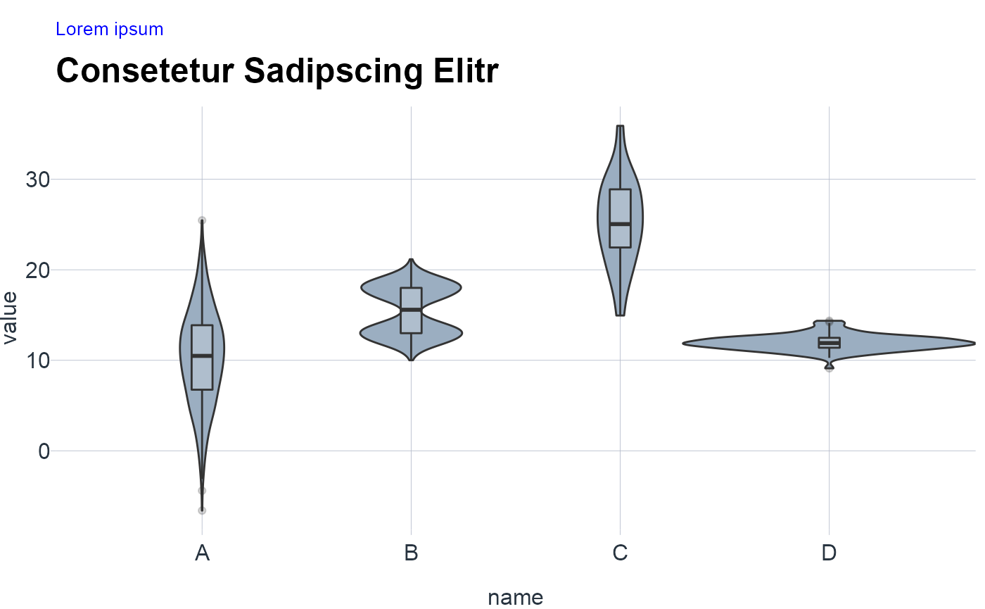
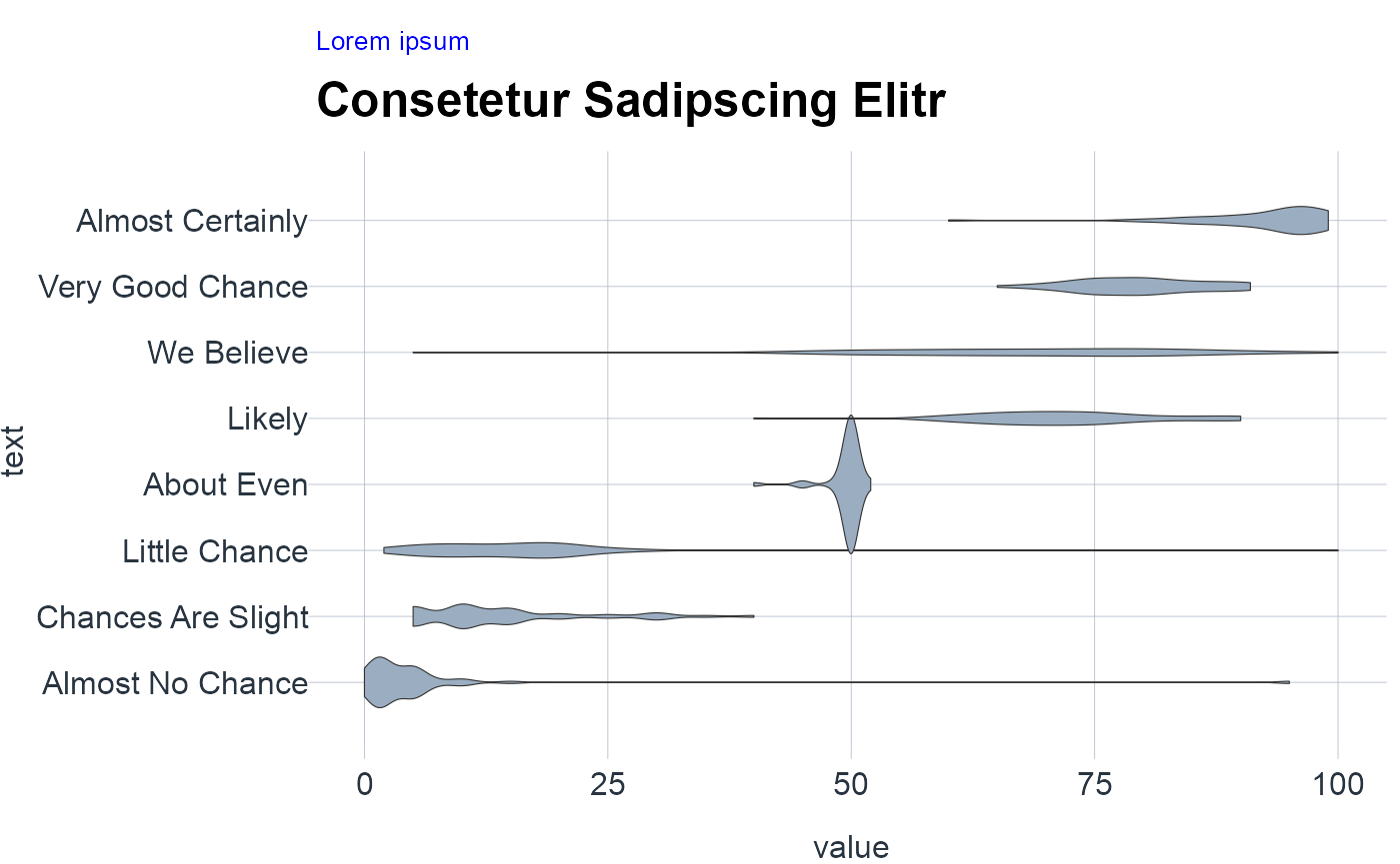
Distributions
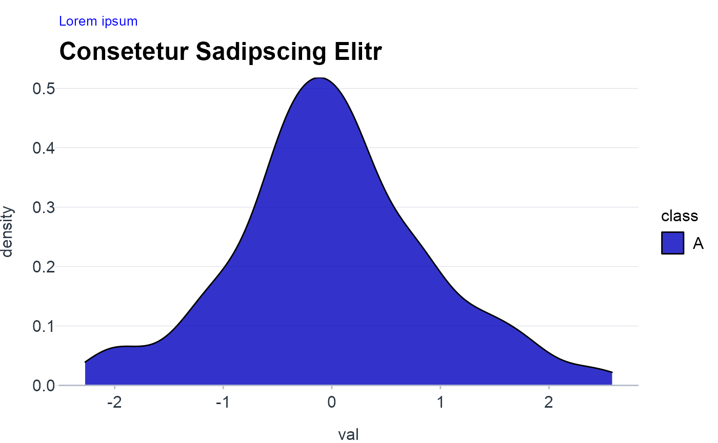
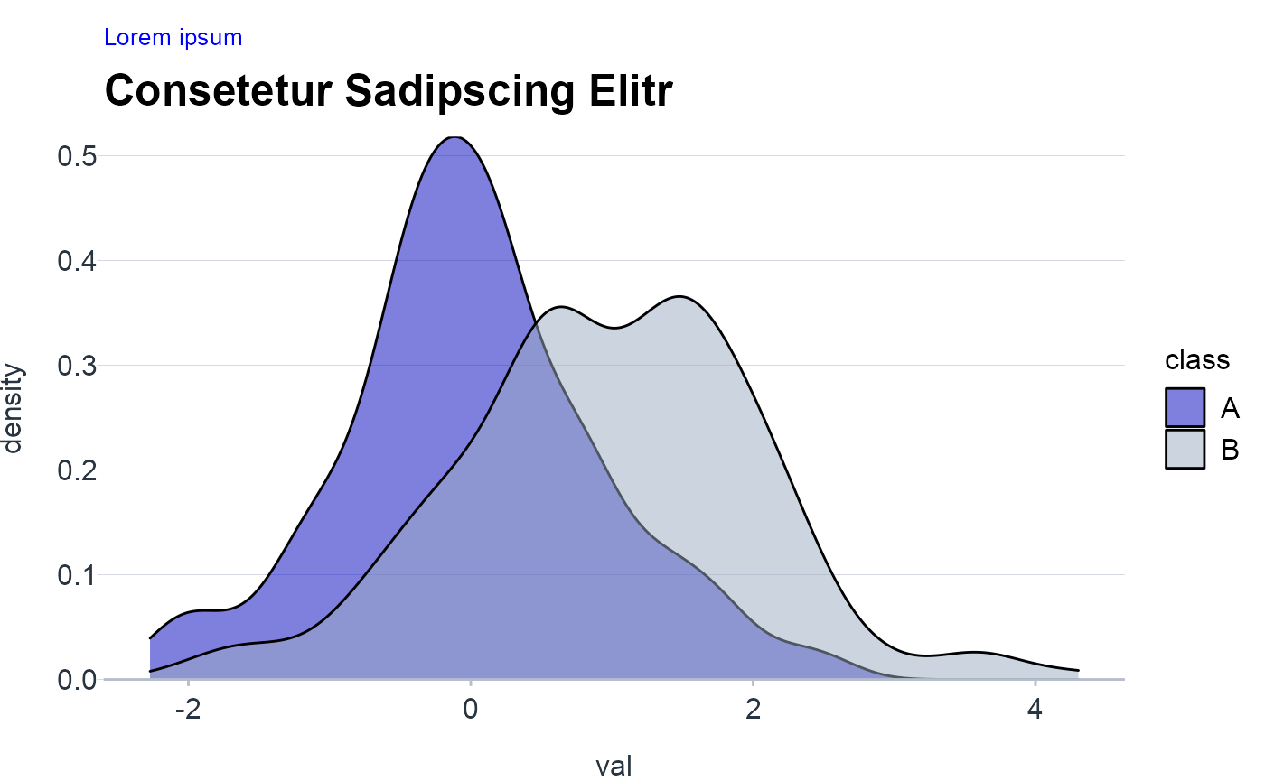
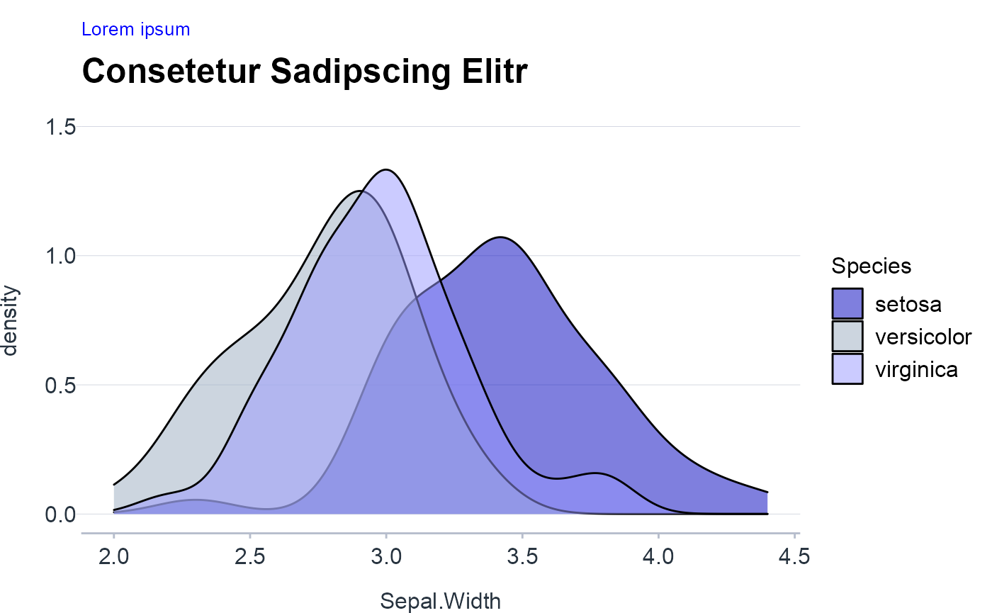
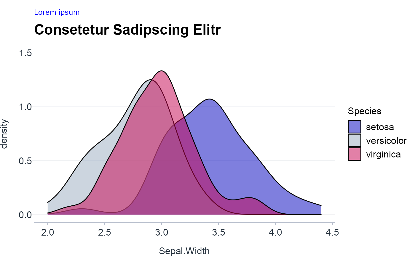
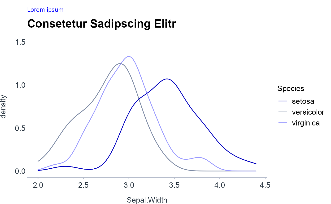
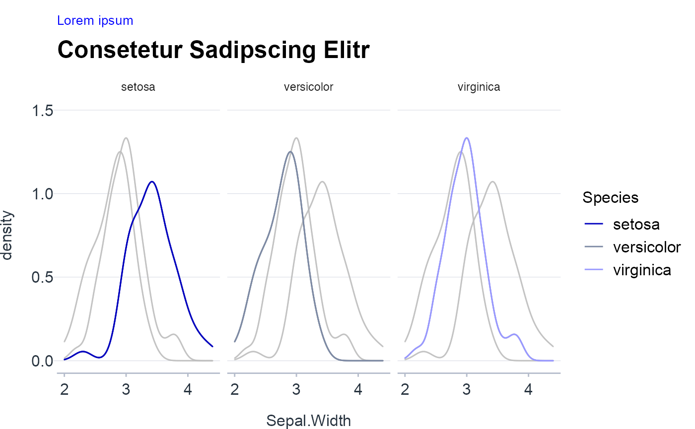
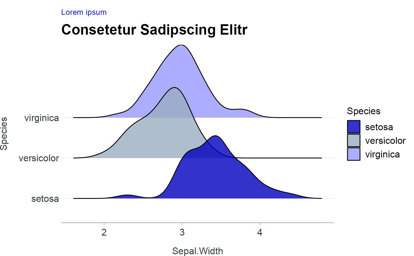
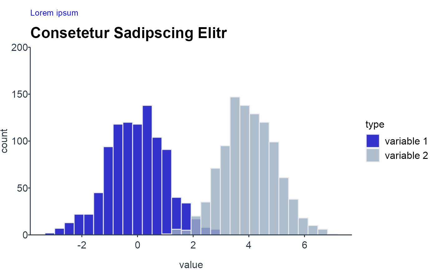
Density chart multiple
NOTE: For more than 3 densities the plot can get very cluttered. While you change the plot type to violin plots or jittered box plots there are further alternative ways of displaying densities as depicted in the following tabset which help to reduce the clutter.
Trend & Time
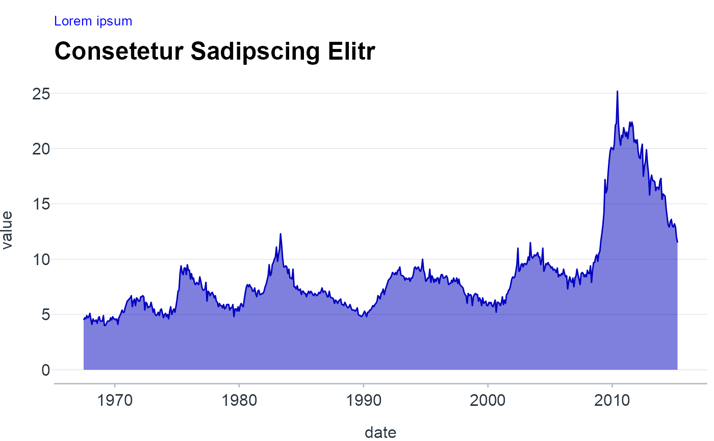
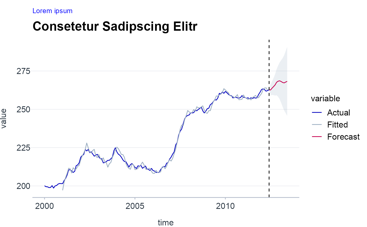
Series
NOTE: For a single line one can also fill the area under the curve with a solid color. This choice can emphasize a trend in the data, because it visually separates the area above the curve from the area below.
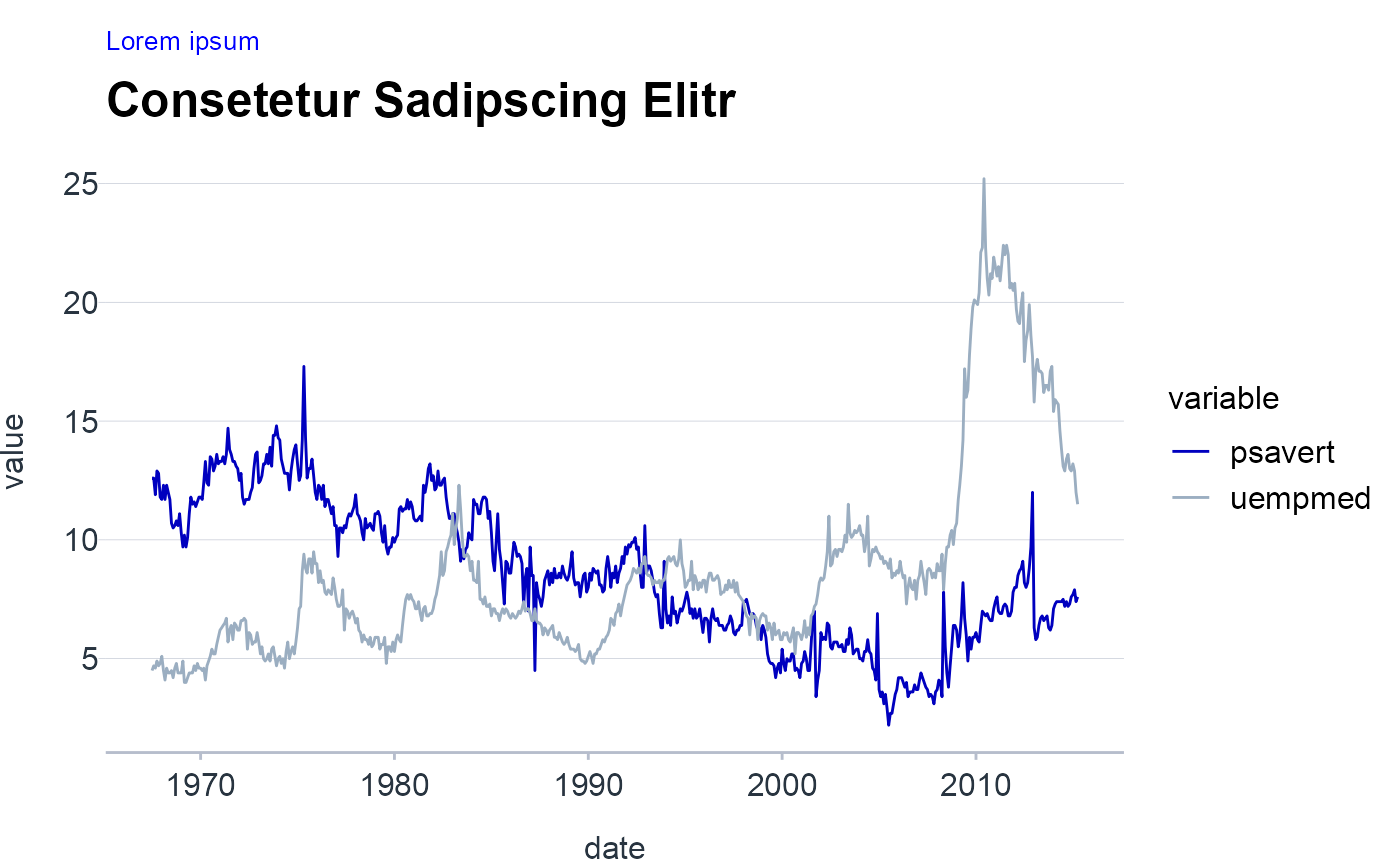
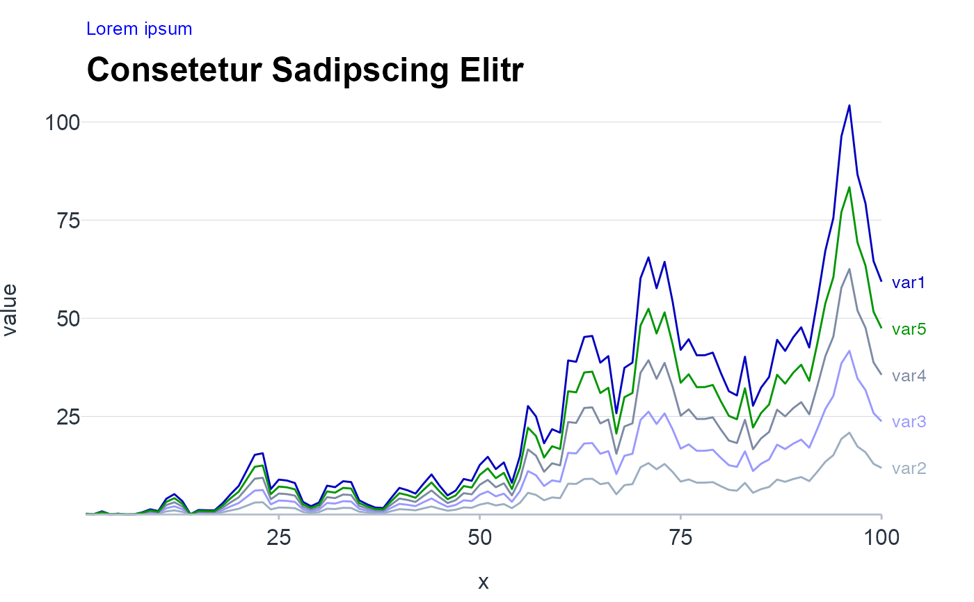
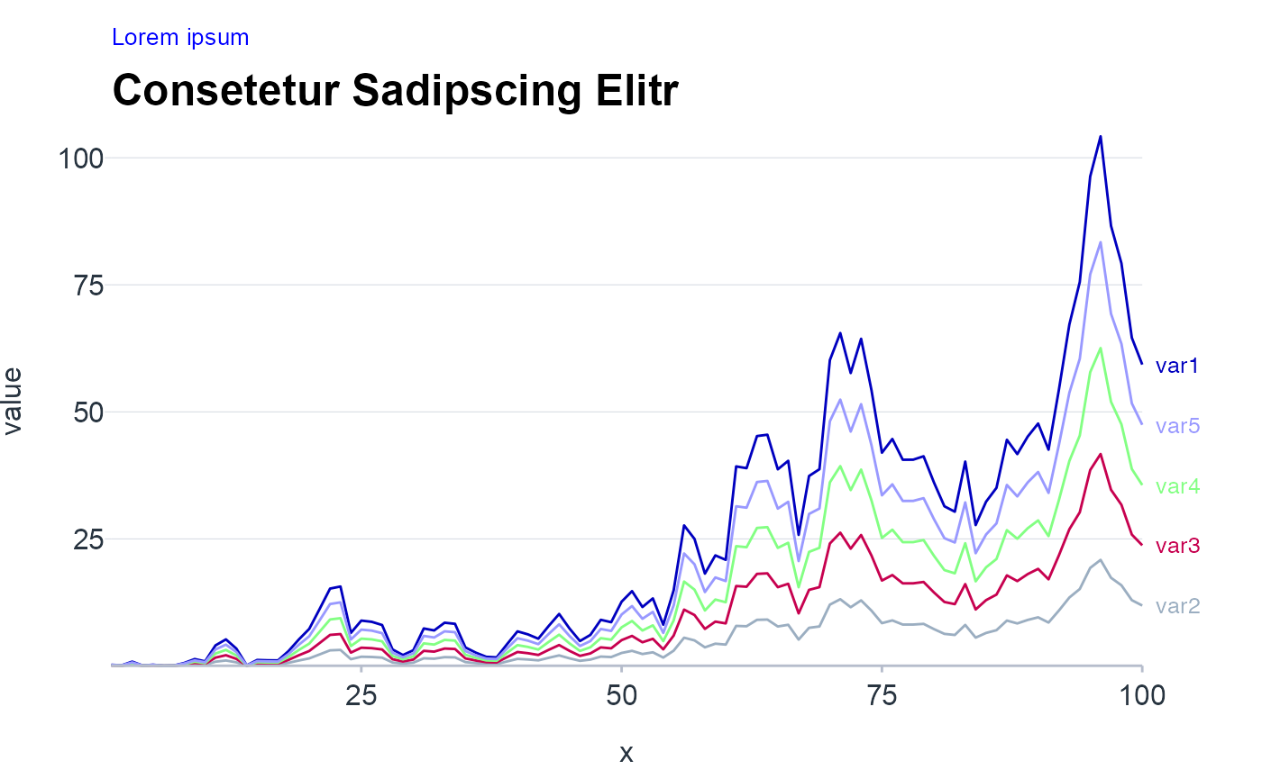
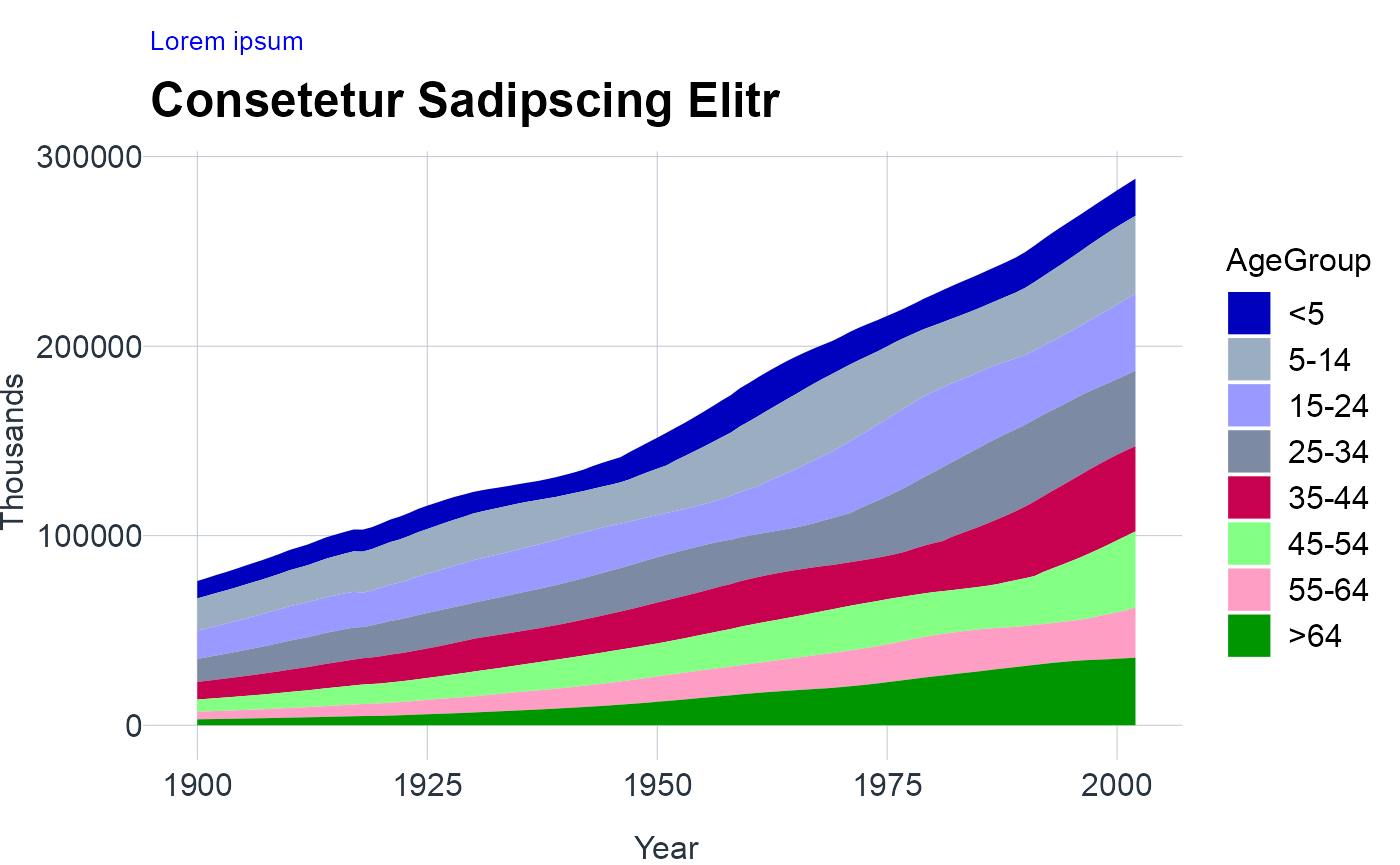
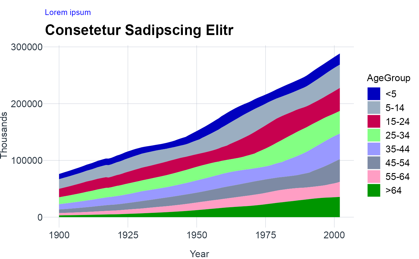
Series multiple
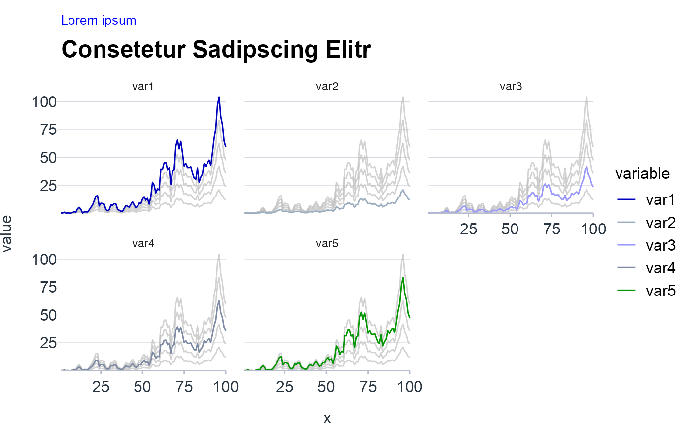
NOTE: For multiple time series there is danger of visualizing a spaghetti chart. Hence, one technique to reduce the mental load is to directly label the lines since matching multiple lines with the legend is cumbersome. Alternatively, if the clutter is too overwhelming the following tabset presents further techniques to plot multiple series.
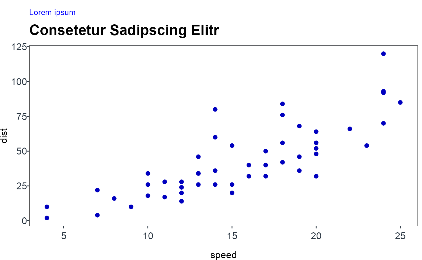
Relationship
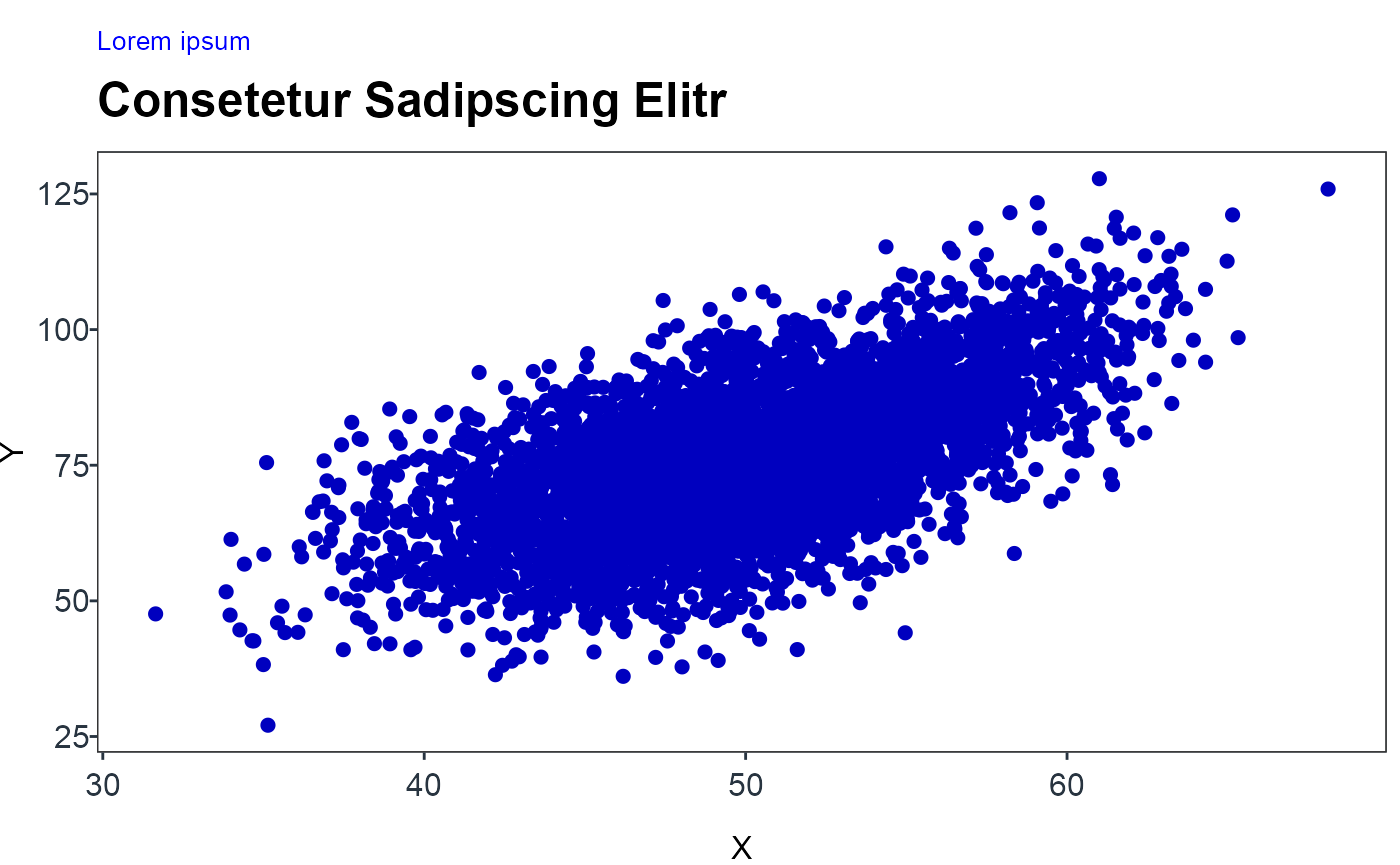
Scatter chart
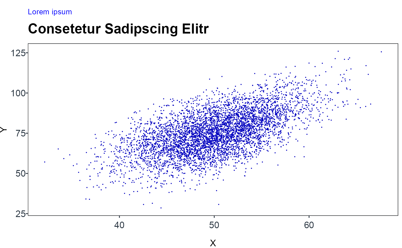
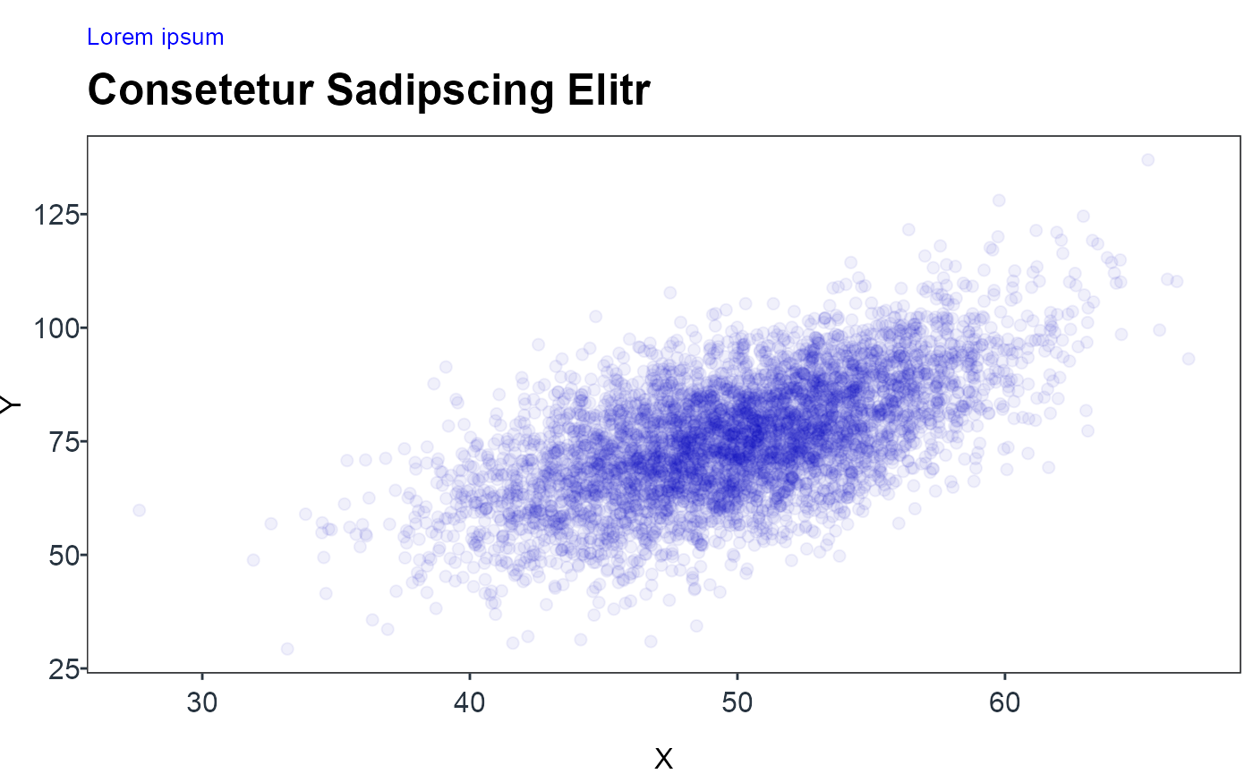
NOTE: The second plot shows a common problem to scatter plots, namely overplottling. The following tabset of alternatives present some easy workarounds. If a categorical variable is present common techniques such as facetting or highlighting apply.
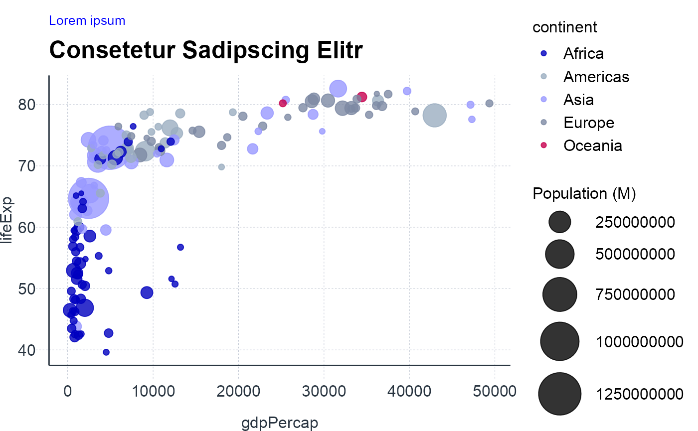
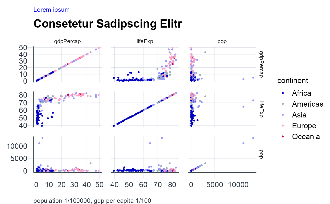
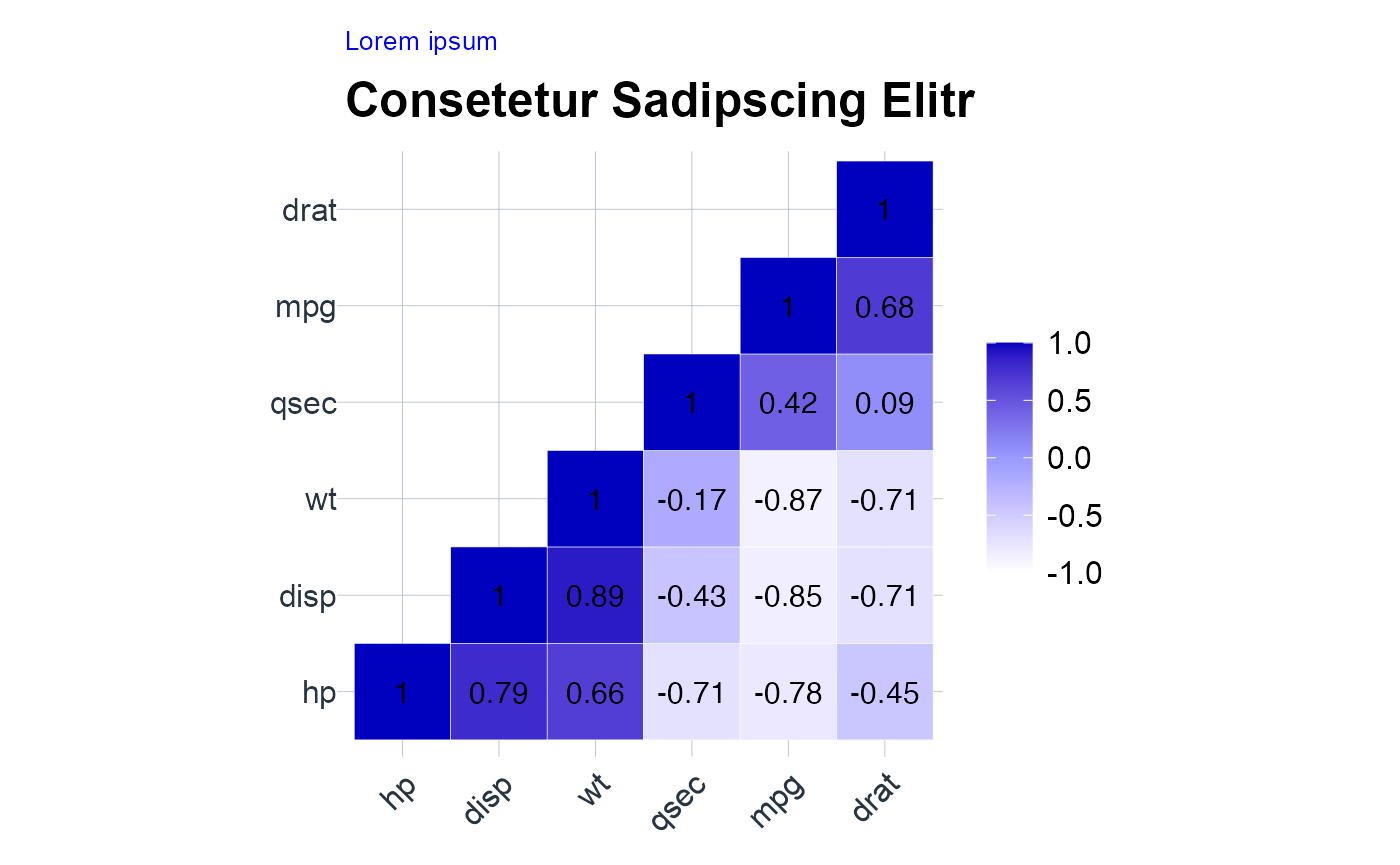
Bubble chart
NOTE: The differences between values encoded as bubble size are harder to perceive than differences between values encoded as position. Hence, the “All-against-all chart” is on alternative. In addition, one can also opt for a correlogram as described in the next section. Besides, bubble charts can also suffer from overplotting.
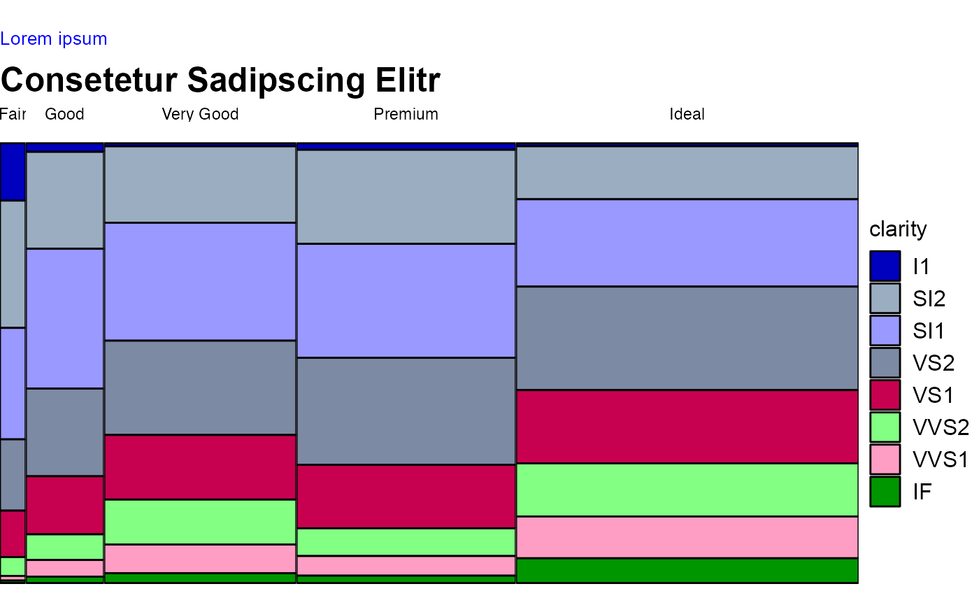
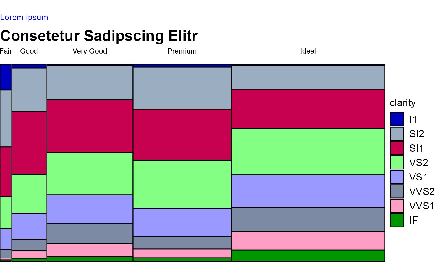
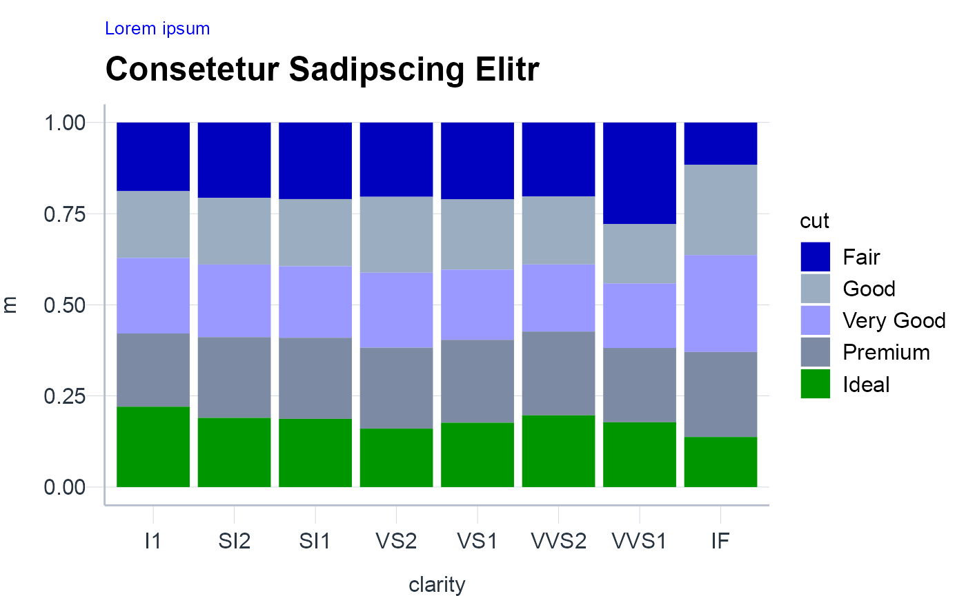
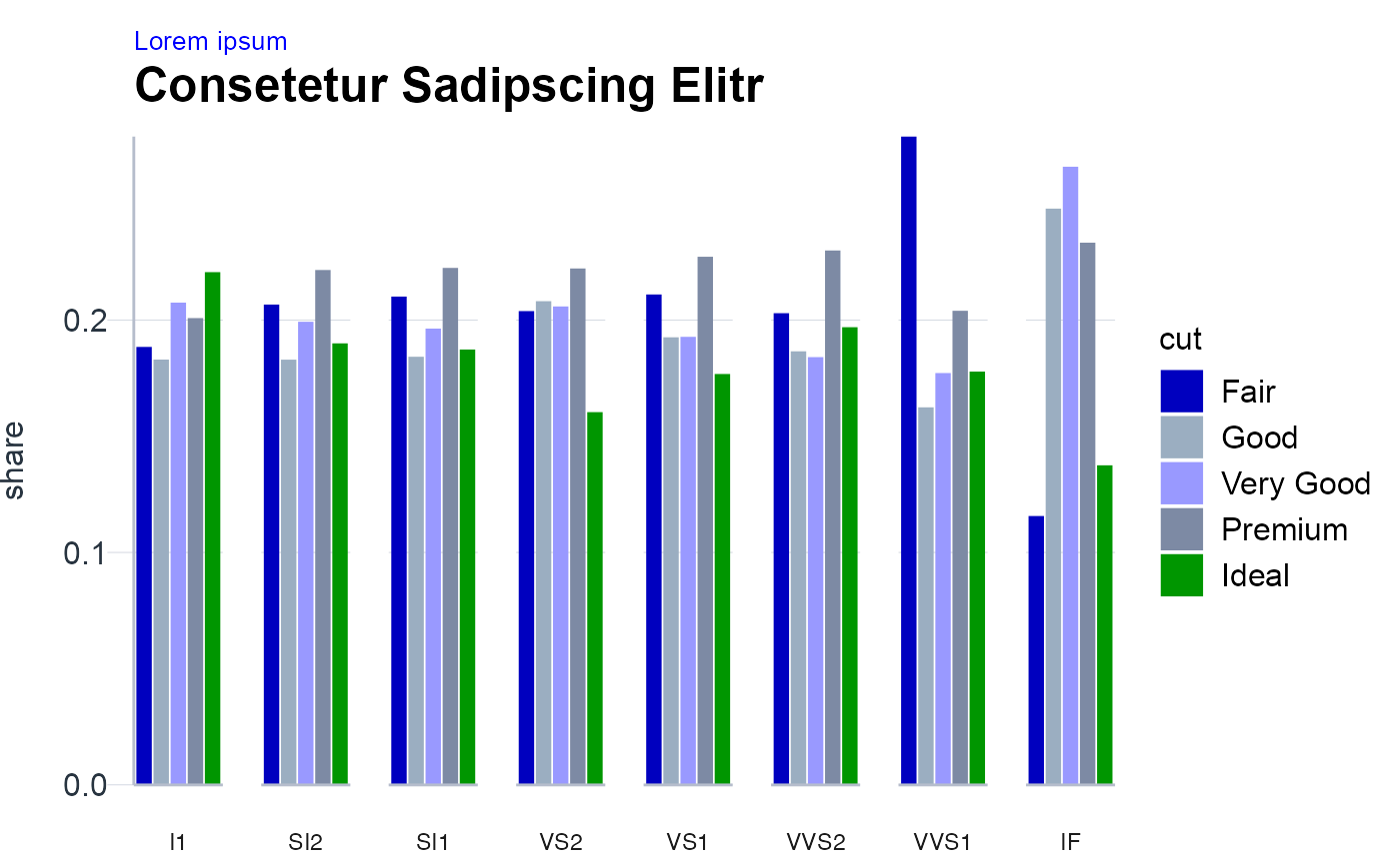
Comparison
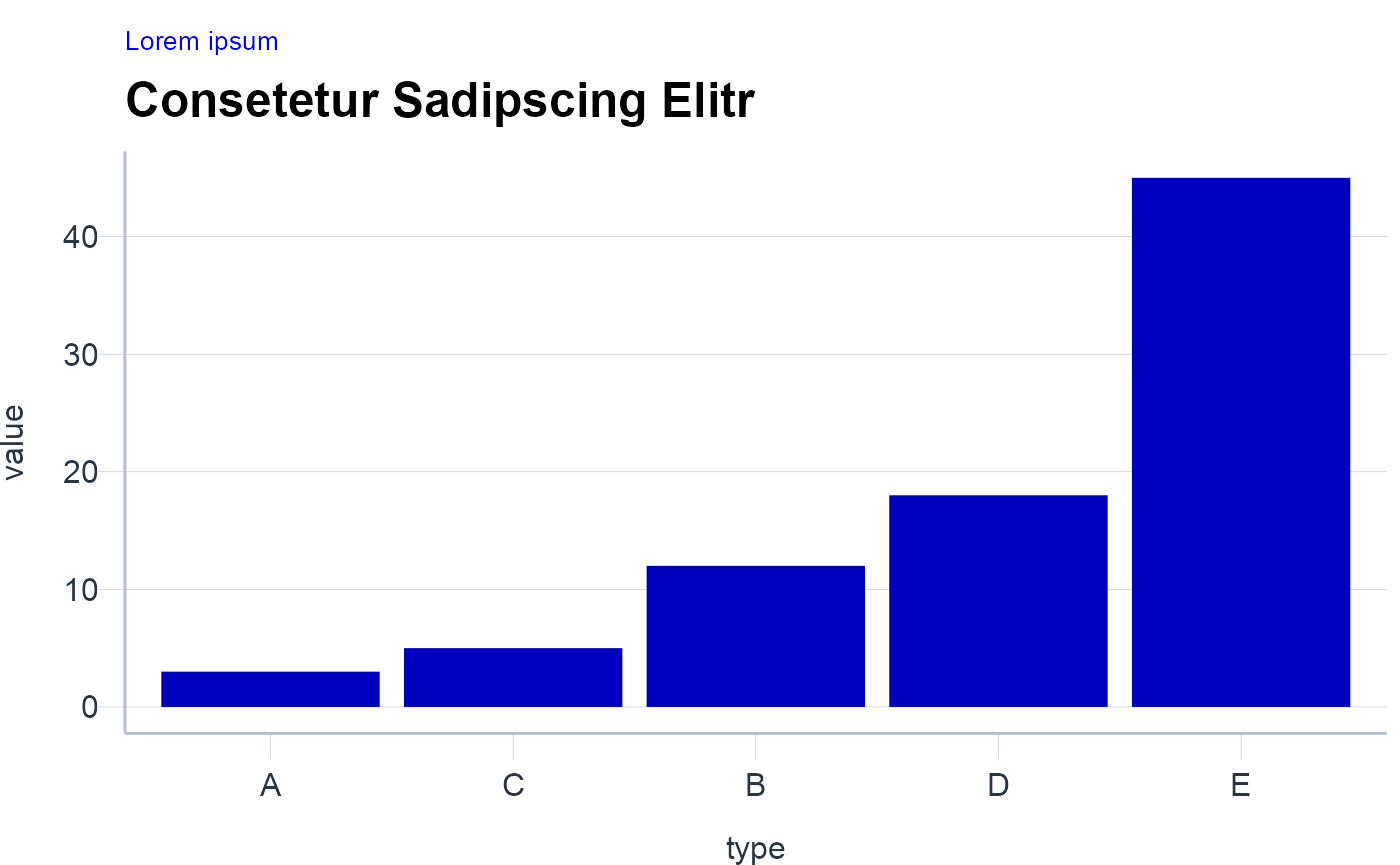
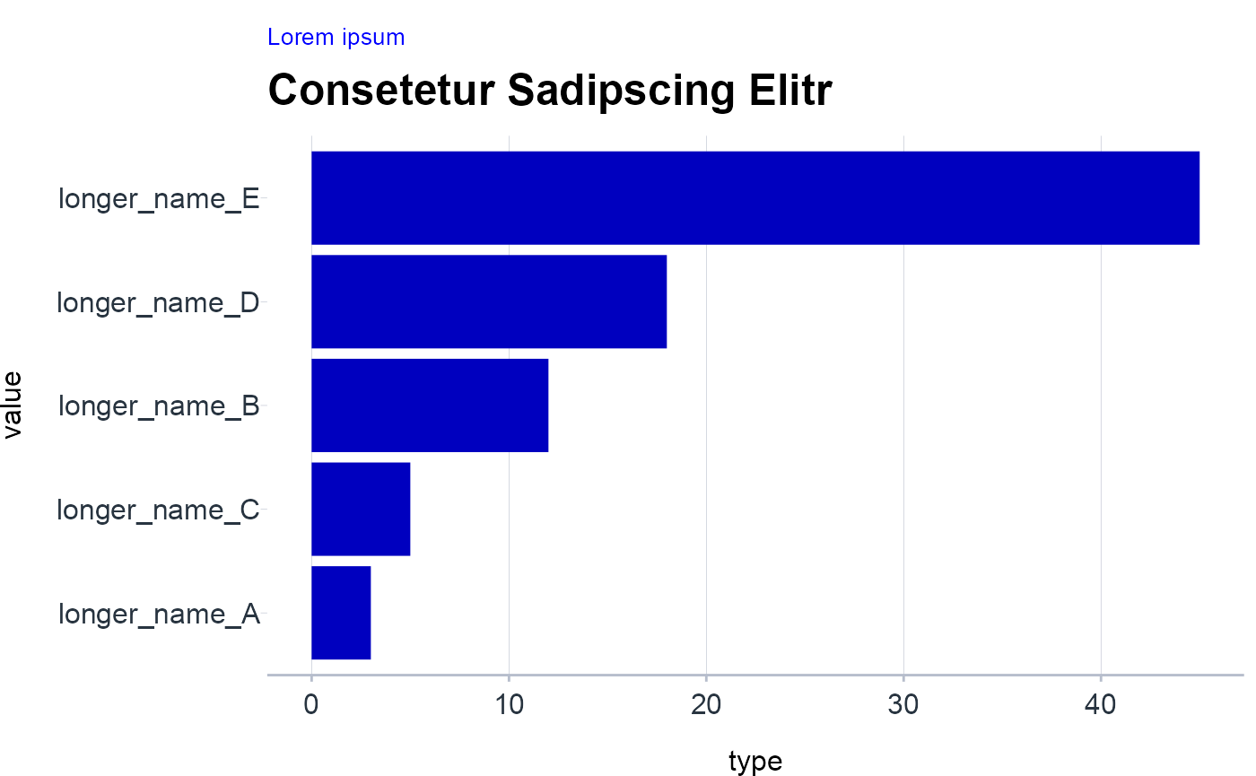
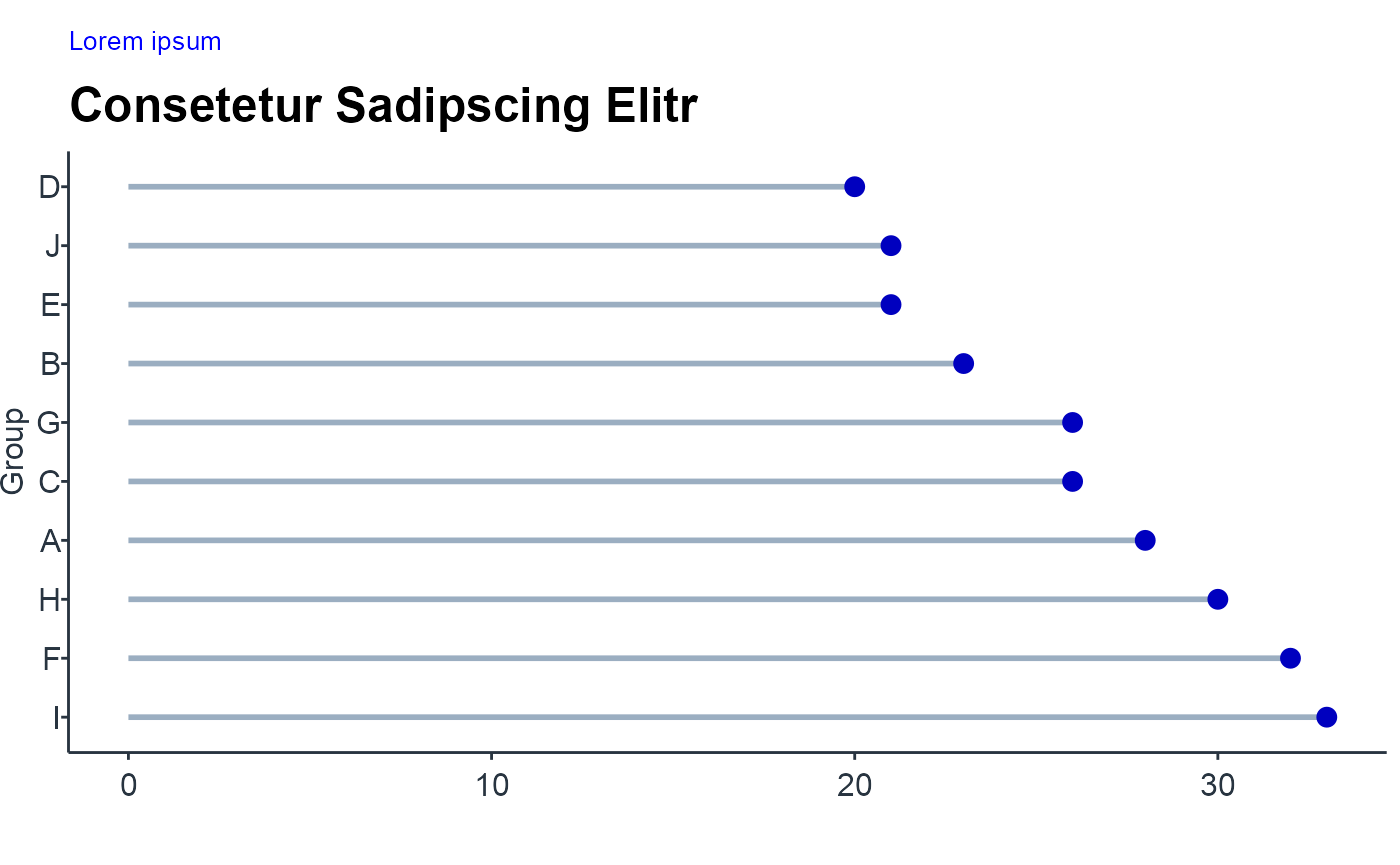
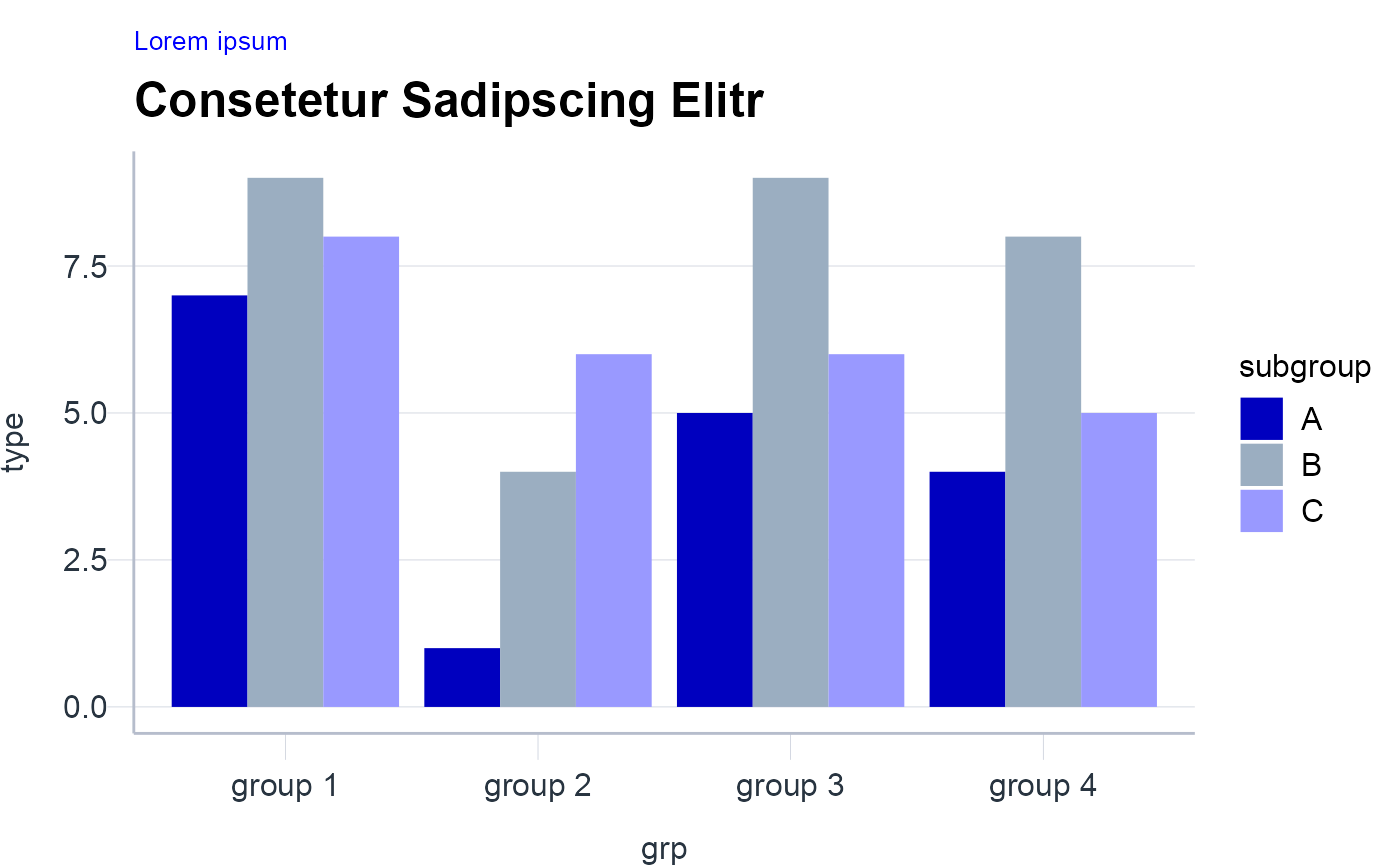
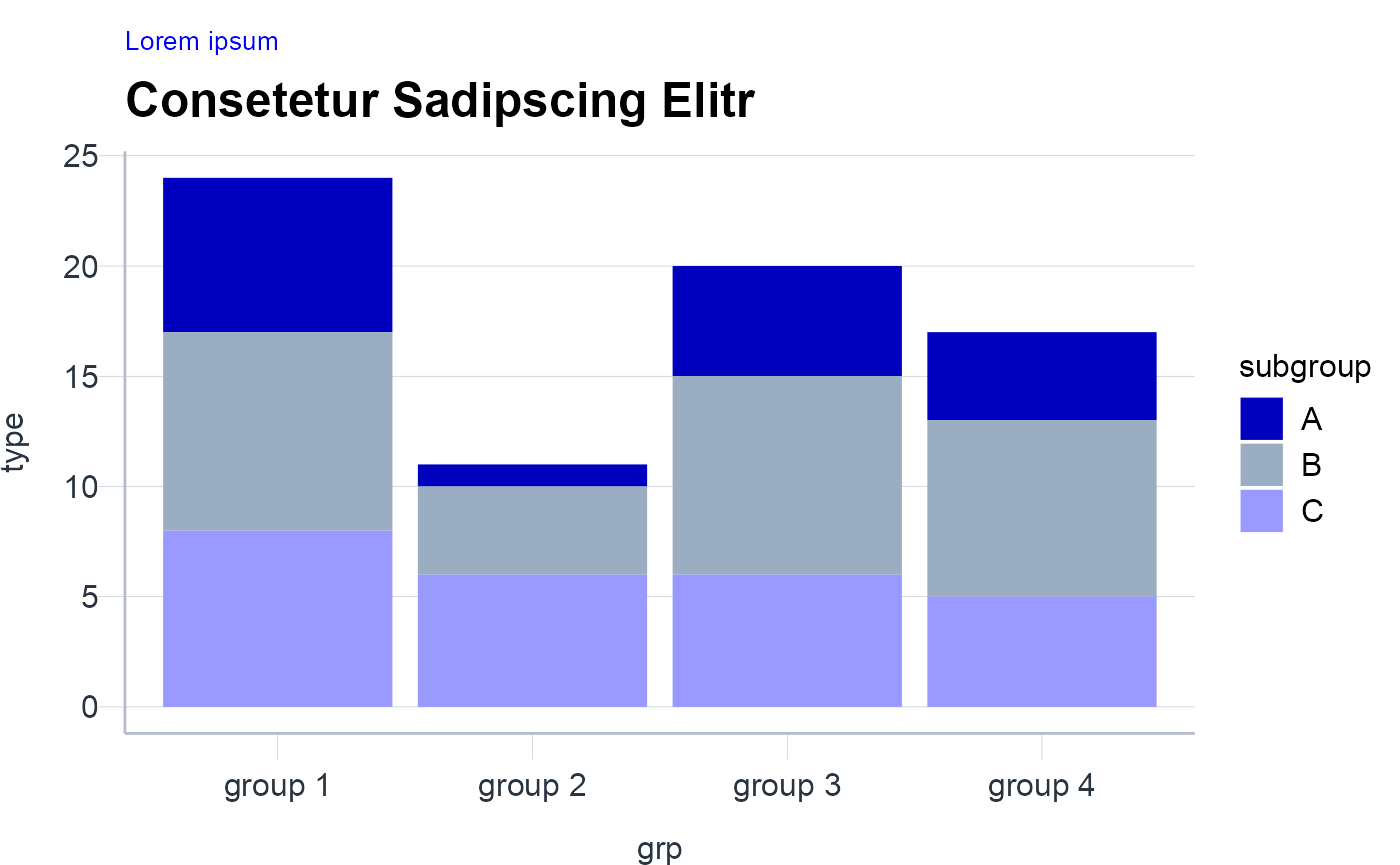
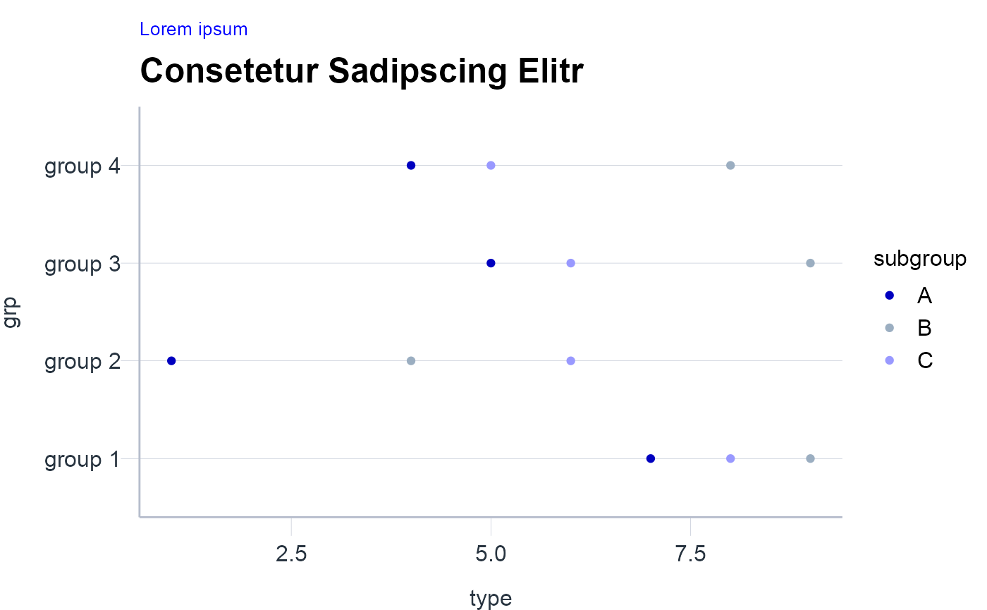
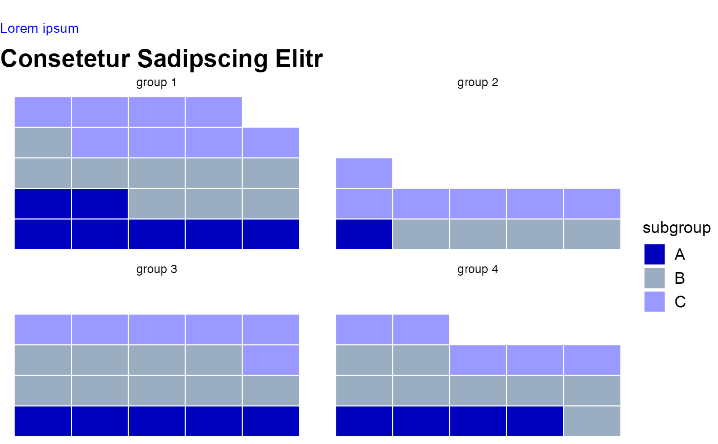
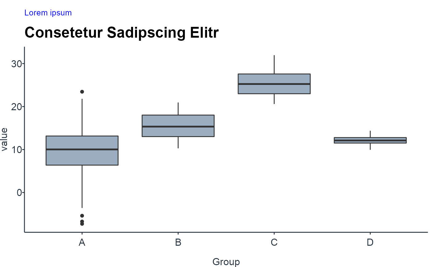
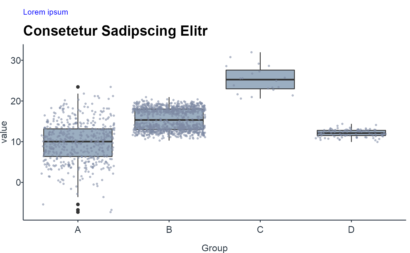
Bar chart
NOTE: One should only rearrange bars, when there is no natural ordering to the categories. Whenever there is a natural ordering (i.e. when our categorical variable is an ordered factor) one should keep the original ordering in the visualization.
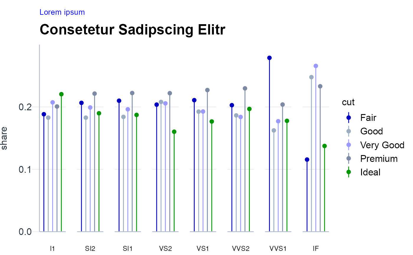
When bars are of similar length it is visually less appealing to use bar plots (“Moire effect”). In this case, one can resort to use Lollipop charts.